Trichromes in GIMP
Trichromy is an interesting photographic process that I’ve written about before, an article Assembling a trichrome digitally is a fairly simple task, although it involves a lot of pieces. In putting together those pieces, there are a lot of choices you can make that will influence the final outcome – you are, after all, assembling a color image from its base components. But, getting started, getting a color image that resembles what you were shooting, is easily explained. I personally use Photoshop for this task, and if you’re also using PS, you can either align the layers by hand using the same difference trick that I talk about below, or you can have PS auto-align the layers for you. Once you’ve done that, you can label your layers r, g, and b, and let my Photoshop Action do the colorization for you.
But, the truth is that not everybody can afford nor does everyone have the need for Photoshop. And if you’re not using PS, you’re probably stuck fiddling with the GNU Image Manipulation Program, aka The GIMP, a fitting name for such open-source hackery. I wet my feet in GIMP, and it’s a capable albeit frustrating piece of software. Unfortunately, it hasn’t stuck to a consistent UI over the years, and (apparently) the only real trichrome tutorial out there for GIMP is outdated. Another unfortunate reality is that it uses a sloppy open source UI toolkit rather than native widgets, so this means that from OS to OS, build to build, the UI may not be consistent with itself, and certainly won’t be consistent with your native look and feel. With these caveats in mind, I’m running the “native” (hah) build of 2.8.2 on OS X. My screenshots will show the contextual menu that is available by right-clicking on the photo – on OS X, this is also repeated in the standard menubar. Presumably Windows versions also have these menus where the user anticipates them being, but I can’t say for sure.
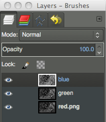 So, let’s get started. Seen here is your layers panel, which will appear on the right of your screen (hopefully). The first thing you’ll need to do is open all three of your black and white frames, and paste them into one document. Save yourself some heartache and give the layers appropriately descriptive names. Putting them in r, g, b order would probably make sense as well, but it’s not strictly necessary (mine are backward, apparently).
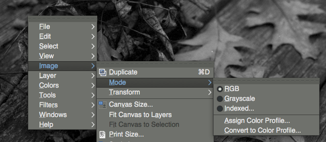 Before we do anything to these images, we need to make sure we’re working in RGB mode. If you’re working off of JPEGs, you’re fine. But, I work largely in PNGs, and if I’m working in black and white, generally it’s indexed to 256 shades of grey. If you’re in indexed color mode, you’ve hit a stop sign – things we try to do from this point forward will error out. So, make sure you’re in RGB by right-clicking on the image (or using whatever menu system you have at your disposal), going to ‘Image,’ ‘Mode,’ and then ensuring that ‘RGB’ is selected. Once we’re working on an RGB image, we can start doing some actual work.
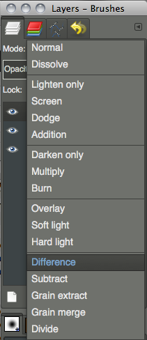 We need to get our layers aligned. Hopefully this is a relatively simple process, not troubled too much by changes in film curl or (horror) major shifts due to insufficient camera support. For the purpose of this tutorial, we’re going to assume the best case scenario – that we only need to translate the three frames so that they fit atop one another. The best trick I know for lining up layers in any imaging software is to exploit the difference blending mode. So, we’re going to leave the bottom-most layer alone, and set one of the upper layers to ‘difference,’ using the blending mode dropdown at the top of the layers panel.
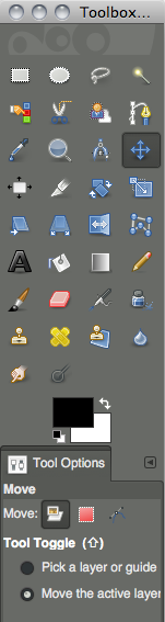 To actually move our layers around, we have to do two things. First, we have to choose the move tool in the upper section of the toolbox (which should be to the left of our screen). But then, inexplicably, we also have to tell it that we want to move a layer. In the lower section of the toolbox, we need to choose the leftmost option next to ‘Move:’ which corresponds to layer. Who did you say headed off your UX team again?
Now we move the layers around. Use the mouse to get it approximately in place, and the arrow keys to push it pixel at a time (make sure you’ve clicked on the image window first). Layers are selected by clicking their names in the layers panel, visibility is controlled by clicking the eyeballs to the right of each layer’s name (which isn’t necessary, but might help with one’s sanity).
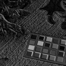
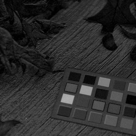
Now the trick to using difference blending for the sake of aligning layers is to look for where ‘edges’ start to appear. The image above and to the left shows what we do not want. Things have very distinct edges, bumpy textures are exaggerated, it’s like we’ve applied a really cheesy filter after having bought Photoshop for the first time. We want to minimize this, and get our image to look more like above to the right. If we were lining up images that were truly identical in spots, we’d want those areas to go true black, but we’re unlikely to have that while assembling trichromes, because our frames all contain different information by necessity. Once you’ve lined up one of your upper layers, set it back to normal and do the same thing with the other. Once we make the image color, we may notice alignment issues that are more prominent in color, but this is a good way to start.
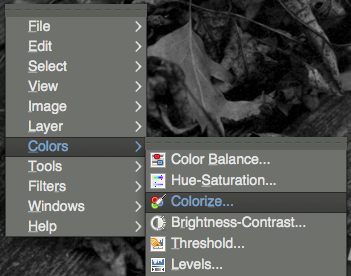
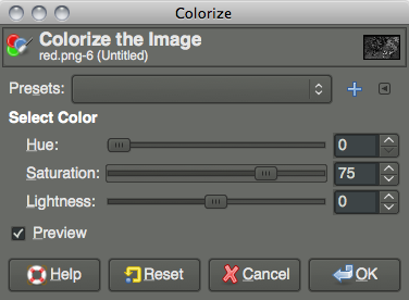
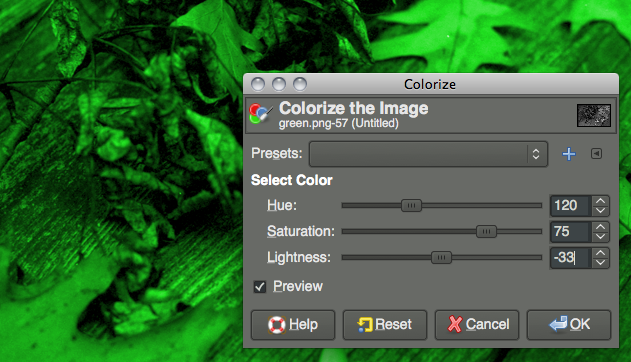
We need to give our layers some color. Choose your red layer from the layers panel, and right click on the image (or use whatever menu system you have at your disposal). We need to go to ‘Colorize…’ under the ‘Colors’ menu. Once we’ve selected that, we should see a window as above right. We’re going to need to do this three times, once for each of our layers. Since we’re working with a 360° color wheel, we need to set ‘Hue’ to 0 for our red layer, 120 for our green layer, and 240 for our blue layer. Despite GIMP not telling us we’re working in degrees vs. percentages, we are. So, on our red channel, we set ‘Hue’ to 0, and we want to push ‘Saturation’ up a bit, I generally set it at 75 when I’m working in Photoshop, and that seemed to work well in GIMP as well. Obviously, push this higher or lower to achieve different color saturation effects. Also, and I didn’t have the foresight to do this when I was taking these screenshots (I corrected it later by adjusting levels), we want to bump lightness down to about -30 (we’re working in something resembling percents here, -33 might make more sense). The reason for this is that we’re adding three images together that (hopefully) have been exposed, scanned, &c. under the pretense that each frame stands on its own. When we add them, the image will be bright! So, we can mitigate this at this point in the game by cutting a third of the light from each channel. Do this for all three layers, again, using 0 for the hue for red, 120 for green, and 240 for blue, and keeping saturation at 75 for all three (as a starting point) and lightness around -30.
 As you’re working, if you have the ‘Preview’ checkbox active, you should be able to see the colorization happening (remember, select the active layer by clicking its name in the layers panel – and at least while you’re learning, make layers up top invisible by turning off their eyeball icon).
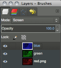 Once we’ve done all three layers, we need to blend them together. Go back to the layers panel, and at the top where we chose ‘Difference’ before, we need to set both of our two topmost layers to ‘Screen’ instead. We can leave our bottom layer as ‘Normal.’ And, we should have a color image! Any glaring alignment errors may present themselves now, and we can leave our layers set to ‘Screen’ so that we’re working in color, but move our layers around atop one another as before.
Other tutorials are surely out there for spotting out dust, cropping (well this one is simple, use the ‘Rectangular Select’ tool which can be bound to aspect ratios &c., and go to ‘Image’ menu, ‘Crop to Selection’), color correcting, exporting, &c. But as far as getting a color image out of three frames of black and white film, well, you’re there. Note that I am not a GIMP expert, and there may be a better way to do this. I was mimicking my method that I use in Photoshop. There is at least one other method – replacing the channels (rather than colored layers) in an RGB image with the data. But in Photoshop, aligning them, changing levels, any sort of modification after the fact is far more of a hassle if the process is done this way, and it didn’t seem like it was any simpler in GIMP.
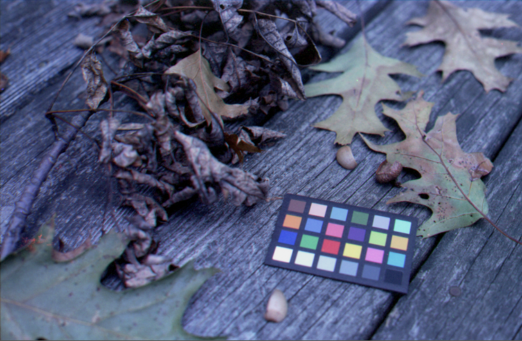
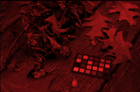
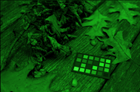
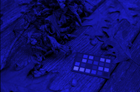
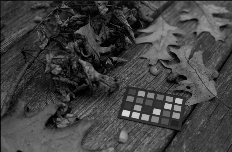
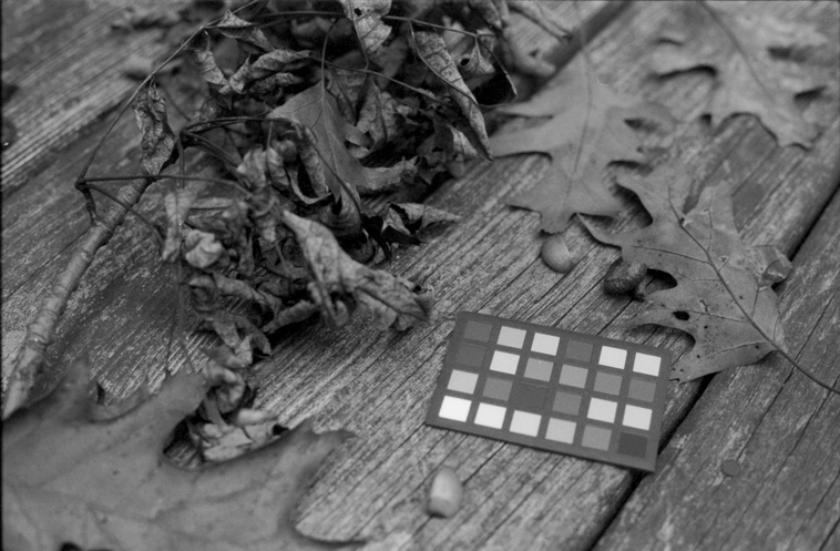
If you want to experiment with the image I was using, you can download my three frames here: red, green, and blue. These were shot through 29, 61, and 47 Wratten filters respectively, on Fomapan 200 film. The chip chart is a GretagMacbeth Mini ColorChecker. Also, if you’ve read all of this and haven’t checked out the awesome Trichromy group on Flickr, you certainly should. Happy trichromy!