Is that a rangefinder in your pocket, or..? (the Contax T)
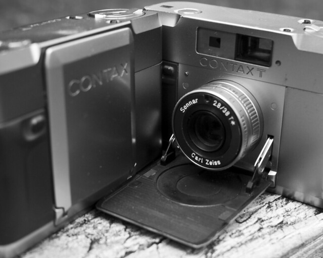
two contax t rangefinders. (click any photo to view on flickr).
This is probably the third article I’ve written about the Contax T, and hopefully the last. I scrapped the others because they simply didn’t live up to the camera. I wrote one article comparing the T to an Olympus XA. This makes a lot of sense to me – both are aperture-priority (only) manual focus rangefinders with nearly identical compact dimensions. But this article was unfair – I own two Ts and zero XAs. I have used an XA, and have pretty clear memories of the things I didn’t love about it, but until I buy another one for the purpose of comparing to the T, I don’t think it’s quite right to base an article upon said comparison. I do plan to do this, however, as the T seems very strongly influenced by the XA, so I guess my earlier statement that this will be my last article on the T was a lie.
In truth, though, it would also be unfair to the T to lead with an article pitting it against another. The T doesn’t solely exist as an alternative to the XA, the T stands strong on its own. These days I’ll carry any number of rangefinders with me into DC, but I have to consider how much pedestrian traffic I’ll be subject to (or, how sardine-like the Metro will be), how much bulk a given camera will add to me, and how sturdy said camera is, just in case. On days when I don’t want to deal with this decision, or nothing seems like a great idea, the Contax T comes with me. More often than not these days, unless I really feel like shooting something else, or I have something specific in mind for medium format, the T is the camera I want by my side anyway. This is largely due to its lilliputian yet sturdy nature. I can keep it in a small pocket in my messenger bag (rather than strapped separately around my neck), not notice a major weight increase, and trust that it’s not constantly on the brink of being crushed.

a diptych showing some decent separation via depth-of-field with the 38/2.8
Of course, aside from being sturdy and small, a camera needs to be good at taking pictures. And it needs to be good at working with its operator, which of course means something different to everyone. For me, the T works out quite well on both counts. The lens, a five-element 38/2.8 Zeiss Sonnar T*, is a stunning chunk of glass in a small barrel. Of course lenses are more than just their optics, and this is where things get a bit more interesting. The focus feel is amazing, better than most larger lenses I’ve used, and the best I’ve ever felt in something so compact. Unfortunately, there is no focus tab, so you are stuck handling a very tiny ring. Focusing is tricky in a package this small, as blocking the rangefinder in the process is pretty much inevitable. Compounded with the tiny aperture ring inexplicably stuffed behind the focus ring, and the lens is not really the most ergonomic thing to use.
This is an important point to note, because the camera is manual focus only, and aperture priority only. The user will be spending a lot of time with these rings. If you want to blow it all to the wind and rely on hyperfocal, this is indicated with f/8 in green on the aperture ring, and a green dot and DOF scale on the focus ring corresponding to hyperfocal at f/8. Aside from these controls, the user is granted a +1.5 EV exposure compensation button on the top deck, as well as a self-timer switch, and of course the shutter release. The release itself is an unnecessary touch for the luxury market – a synthetic ruby designed by Kyocera’s Advanced Ceramics division. As this was Kyocera’s first creation under the Contax name, it’s understandable that they wanted to go all out. Understandable, but still a bit humorous. Anyway, the ergonomics of the camera are not the best, even for my tiny pixie hands. I can’t even begin to imagine the sort of person who likes to slap gigantic battery grips on their already massive SLRs handling one of these petite cameras.
out of focus areas get a little bit edgy at times, but images are crisp.
The aforementioned +1.5 EV compensation button is the only real control over exposure that a T user gets. However, the T does not (thankfully) rely on DX codes to set the meter ISO, so as long as you’re mindful of what you’re doing, you can adjust ISO for whatever compensation you need. ISO readout is on the back of the camera, adjusted by pressing a button on the back and rotating the outer ring of the rewind knob. Metering is not TTL, but rather via a sensor on the front of the lens, immediately above the front element. The lens is not threaded for filters, but if one was to find slip-on filters that would fit, they would (thankfully) be over the meter sensor as well. Using common sense to compensate for backlighting via the +1.5 EV button, and otherwise trusting the meter has yet to let me down. The camera will warn you with an over light if you’re working outside the range of capable shutter speeds, but thankfully it will not prevent you from shooting it anyway. An overexposed shot is, after all, better than missing the decisive moment. There is no AE lock, which is a bit of a let-down.
I mentioned the overexposure light, one of four LEDs inside the finder to give you an idea of the shutter speed. The shutter ranges from 1/500″ down to 8″, with indicators for ’1/500″ – 1/125″,’ ’1/125″ – 1/30″,’ and ’1/30″ – 8″.’ You never know exactly what it’s doing, but you get a sense, and can judge whether you’re in hold-your-breath or I-really-need-a-tripod territory. The finder is bright, has good eye relief, though is a bit small and only ~.75x. The rangefinder spot is a yellow diamond, a nice throwback to Yashicas past. No parallax compensation is provided, not even a frame indicator. No aperture readout, but the aperture adjustment happens in even clicks of full stops, and can thus be adjusted blindly with ease.
the t’s compact size means i always have a camera with me in the district.
Loading the camera is a bit of a trick. Release a latch on the bottom of the camera very carefully (this latch is a common point of failure) The entire back and bottom plate are a single shell which is removed, much like on a Leica CL. Also like on the CL, once opened, there is a swing-down pressure plate on the body side of things. Unfold this, and open up the camera (not doing so reportedly can strip some gears). Get the leader into the takeup, make sure the sprockets are engaged, shut the pressure plate, and wind on a bit. Make sure advancing is smooth, make absolutely sure the sprockets are (still) engaged, and that everything is tight. Frame tolerances are incredibly tight on this camera, and if loading isn’t spot on, overlaps are bound to happen. Put the rear shell back on, and (again, carefully) latch it up.
Just in loading the film, I pointed out two ways in which these cameras die. Despite being made of titanium and tough alloys, despite being designed by FA Porsche, they are somewhat fragile. I have two, and one works perfectly. The other, my day-to-day, is physically beat up on the outside and has some internal issues as well. I’d hazard that the gears have stripped a bit, because I really need to make absolutely sure that the sprockets are perfect, or else it just seems too weak to advance. Fixing this is likely impossible. My latches are fine – if yours are broken, one hackish solution is to keep the body together via a bolt (or similar) in the tripod thread. The meter on my beater is always on when the body is open – my other one works properly and as most cameras do, with a half-press of the shutter button. Sometimes the meter just doesn’t come on, and I have to waste a frame – advancing/recocking the shutter always gets it back in order. Even with these issues, I trust it to be reliable enough to use as a daily user. I understand its failures, and haven’t had new issues pop up. Another issue I have heard of is the velvety ‘bellows’ that permits the lens to fold and unfold leaking light. Users have successfully rigged up their own replacements.

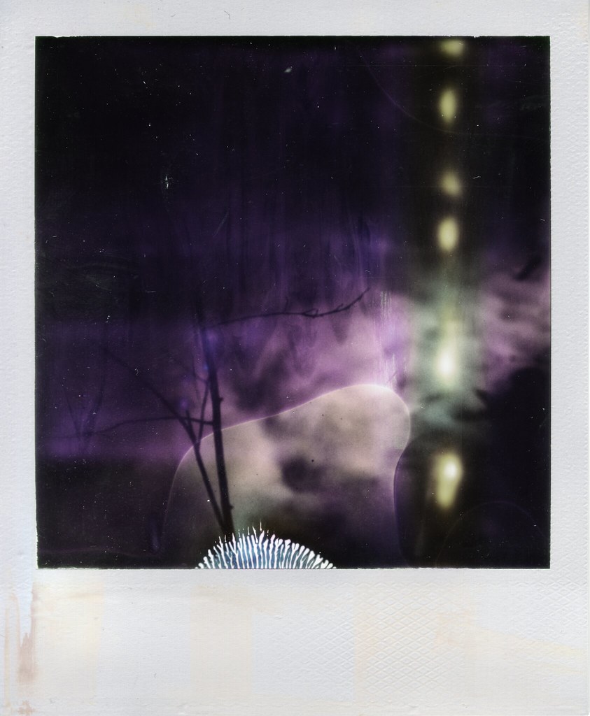
i thought i missed this (personal, important) shot by hitting the end of the roll. fortunately the t’s very tight frame spacing means you consistently get extra frames. also notice the ringy out-of-focus point lights. all rights reserved (not cc-licensed) on portraits inc. this one.
Few final notes to end on. Film advance is manual, with an advance that folds flush (and is metal and fairly sharp, I have cut myself popping it out!), but the film counter is electronic and only readable with the camera open. Beginning to advance the film can trick the counter into advancing, my counter often reads high because I accidentally ‘bump’ the counter into advancing when I’m popping out the advance lever. I think the counter goes up to 74, I guess for those old Ilford long rolls. There’s a small hole in the center of the rewind knob, this can be used to visualize that film is actually advancing. There’s also a flash unit, dedicated and with variable output based on the camera’s meter. I have one for each camera, but have not used them much at all. The original case has a long flap and two snaps – it fits the camera either with or without flash attached. No remote release, self-timer is your only option to avoid shake during long exposures.
The Contax T is a really quirky camera, there’s no getting around that. It’s also pricy to acquire one just to find out whether it works for you or not. For me, it was love at first fondle, and I snatched up the next one I saw as well. I keep mine with me most of the time when I’m not carrying something larger, and I keep it set at its labeled hyperfocal setting for quick deployment. Even with its shortcomings, it’s a camera that has yet to disappoint me with its excellent optics, great feel, and compact size.
Trichromes in GIMP

Trichromy is an interesting photographic process that I’ve written about before, an article Assembling a trichrome digitally is a fairly simple task, although it involves a lot of pieces. In putting together those pieces, there are a lot of choices you can make that will influence the final outcome – you are, after all, assembling a color image from its base components. But, getting started, getting a color image that resembles what you were shooting, is easily explained. I personally use Photoshop for this task, and if you’re also using PS, you can either align the layers by hand using the same difference trick that I talk about below, or you can have PS auto-align the layers for you. Once you’ve done that, you can label your layers r, g, and b, and let my Photoshop Action do the colorization for you.
But, the truth is that not everybody can afford nor does everyone have the need for Photoshop. And if you’re not using PS, you’re probably stuck fiddling with the GNU Image Manipulation Program, aka The GIMP, a fitting name for such open-source hackery. I wet my feet in GIMP, and it’s a capable albeit frustrating piece of software. Unfortunately, it hasn’t stuck to a consistent UI over the years, and (apparently) the only real trichrome tutorial out there for GIMP is outdated. Another unfortunate reality is that it uses a sloppy open source UI toolkit rather than native widgets, so this means that from OS to OS, build to build, the UI may not be consistent with itself, and certainly won’t be consistent with your native look and feel. With these caveats in mind, I’m running the “native” (hah) build of 2.8.2 on OS X. My screenshots will show the contextual menu that is available by right-clicking on the photo – on OS X, this is also repeated in the standard menubar. Presumably Windows versions also have these menus where the user anticipates them being, but I can’t say for sure.
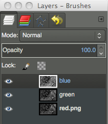 So, let’s get started. Seen here is your layers panel, which will appear on the right of your screen (hopefully). The first thing you’ll need to do is open all three of your black and white frames, and paste them into one document. Save yourself some heartache and give the layers appropriately descriptive names. Putting them in r, g, b order would probably make sense as well, but it’s not strictly necessary (mine are backward, apparently).
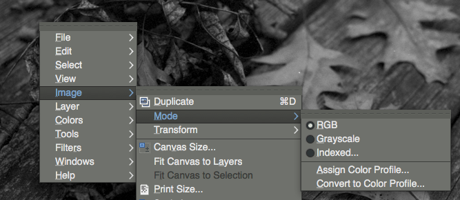 Before we do anything to these images, we need to make sure we’re working in RGB mode. If you’re working off of JPEGs, you’re fine. But, I work largely in PNGs, and if I’m working in black and white, generally it’s indexed to 256 shades of grey. If you’re in indexed color mode, you’ve hit a stop sign – things we try to do from this point forward will error out. So, make sure you’re in RGB by right-clicking on the image (or using whatever menu system you have at your disposal), going to ‘Image,’ ‘Mode,’ and then ensuring that ‘RGB’ is selected. Once we’re working on an RGB image, we can start doing some actual work.
 We need to get our layers aligned. Hopefully this is a relatively simple process, not troubled too much by changes in film curl or (horror) major shifts due to insufficient camera support. For the purpose of this tutorial, we’re going to assume the best case scenario – that we only need to translate the three frames so that they fit atop one another. The best trick I know for lining up layers in any imaging software is to exploit the difference blending mode. So, we’re going to leave the bottom-most layer alone, and set one of the upper layers to ‘difference,’ using the blending mode dropdown at the top of the layers panel.
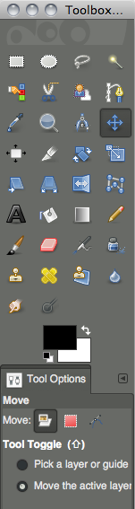 To actually move our layers around, we have to do two things. First, we have to choose the move tool in the upper section of the toolbox (which should be to the left of our screen). But then, inexplicably, we also have to tell it that we want to move a layer. In the lower section of the toolbox, we need to choose the leftmost option next to ‘Move:’ which corresponds to layer. Who did you say headed off your UX team again?
Now we move the layers around. Use the mouse to get it approximately in place, and the arrow keys to push it pixel at a time (make sure you’ve clicked on the image window first). Layers are selected by clicking their names in the layers panel, visibility is controlled by clicking the eyeballs to the right of each layer’s name (which isn’t necessary, but might help with one’s sanity).
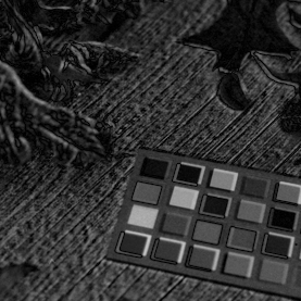
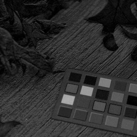
Now the trick to using difference blending for the sake of aligning layers is to look for where ‘edges’ start to appear. The image above and to the left shows what we do not want. Things have very distinct edges, bumpy textures are exaggerated, it’s like we’ve applied a really cheesy filter after having bought Photoshop for the first time. We want to minimize this, and get our image to look more like above to the right. If we were lining up images that were truly identical in spots, we’d want those areas to go true black, but we’re unlikely to have that while assembling trichromes, because our frames all contain different information by necessity. Once you’ve lined up one of your upper layers, set it back to normal and do the same thing with the other. Once we make the image color, we may notice alignment issues that are more prominent in color, but this is a good way to start.
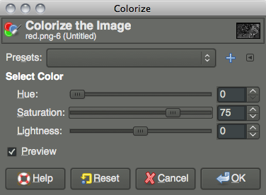
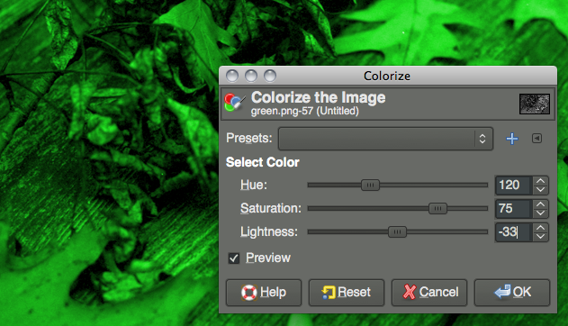
We need to give our layers some color. Choose your red layer from the layers panel, and right click on the image (or use whatever menu system you have at your disposal). We need to go to ‘Colorize…’ under the ‘Colors’ menu. Once we’ve selected that, we should see a window as above right. We’re going to need to do this three times, once for each of our layers. Since we’re working with a 360° color wheel, we need to set ‘Hue’ to 0 for our red layer, 120 for our green layer, and 240 for our blue layer. Despite GIMP not telling us we’re working in degrees vs. percentages, we are. So, on our red channel, we set ‘Hue’ to 0, and we want to push ‘Saturation’ up a bit, I generally set it at 75 when I’m working in Photoshop, and that seemed to work well in GIMP as well. Obviously, push this higher or lower to achieve different color saturation effects. Also, and I didn’t have the foresight to do this when I was taking these screenshots (I corrected it later by adjusting levels), we want to bump lightness down to about -30 (we’re working in something resembling percents here, -33 might make more sense). The reason for this is that we’re adding three images together that (hopefully) have been exposed, scanned, &c. under the pretense that each frame stands on its own. When we add them, the image will be bright! So, we can mitigate this at this point in the game by cutting a third of the light from each channel. Do this for all three layers, again, using 0 for the hue for red, 120 for green, and 240 for blue, and keeping saturation at 75 for all three (as a starting point) and lightness around -30.
 As you’re working, if you have the ‘Preview’ checkbox active, you should be able to see the colorization happening (remember, select the active layer by clicking its name in the layers panel – and at least while you’re learning, make layers up top invisible by turning off their eyeball icon).
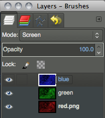 Once we’ve done all three layers, we need to blend them together. Go back to the layers panel, and at the top where we chose ‘Difference’ before, we need to set both of our two topmost layers to ‘Screen’ instead. We can leave our bottom layer as ‘Normal.’ And, we should have a color image! Any glaring alignment errors may present themselves now, and we can leave our layers set to ‘Screen’ so that we’re working in color, but move our layers around atop one another as before.
Other tutorials are surely out there for spotting out dust, cropping (well this one is simple, use the ‘Rectangular Select’ tool which can be bound to aspect ratios &c., and go to ‘Image’ menu, ‘Crop to Selection’), color correcting, exporting, &c. But as far as getting a color image out of three frames of black and white film, well, you’re there. Note that I am not a GIMP expert, and there may be a better way to do this. I was mimicking my method that I use in Photoshop. There is at least one other method – replacing the channels (rather than colored layers) in an RGB image with the data. But in Photoshop, aligning them, changing levels, any sort of modification after the fact is far more of a hassle if the process is done this way, and it didn’t seem like it was any simpler in GIMP.
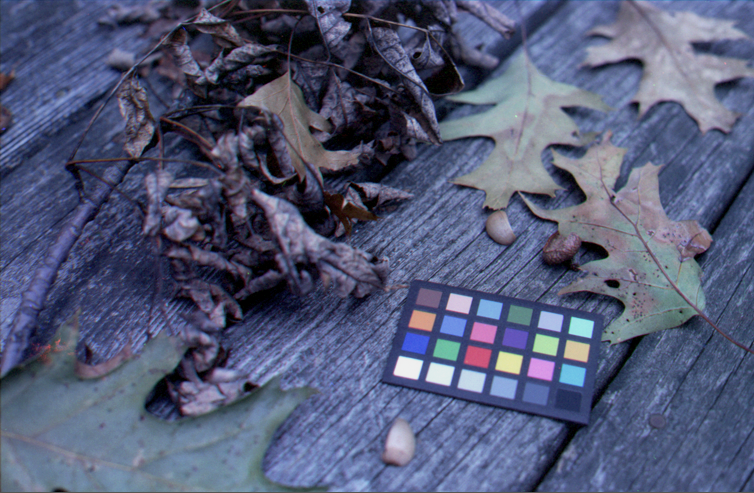
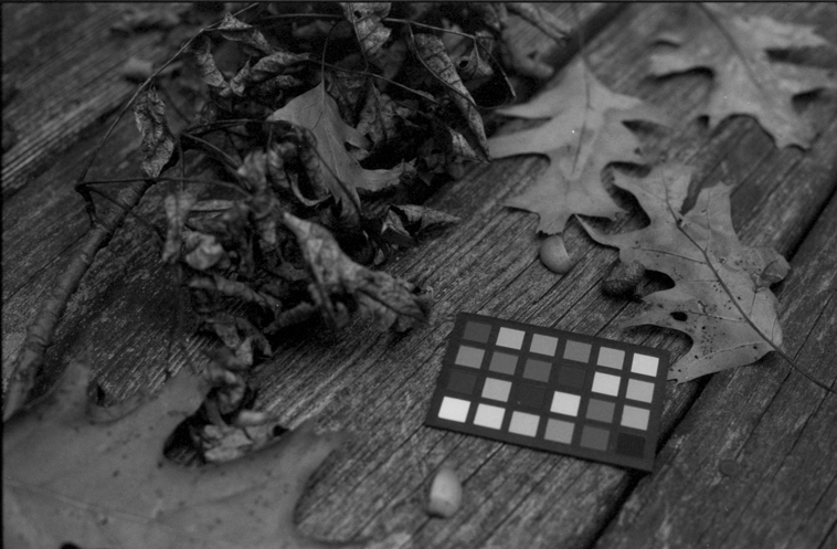
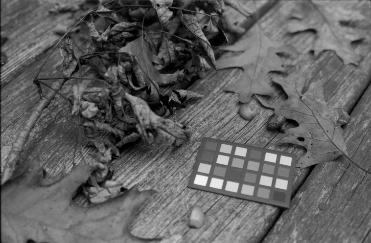
If you want to experiment with the image I was using, you can download my three frames here: red, green, and blue. These were shot through 29, 61, and 47 Wratten filters respectively, on Fomapan 200 film. The chip chart is a GretagMacbeth Mini ColorChecker. Also, if you’ve read all of this and haven’t checked out the awesome Trichromy group on Flickr, you certainly should. Happy trichromy!
Polaroid SX-70
paying homage to the venerable sx-70 (click images to view on flickr)
The Polaroid SX-70 was a groundbreaking camera in 1972. Edwin Land had already impressed photographers with his film that didn’t require a trip to the photo lab. This was still a tedious process, however, requiring the photographer to time out development, stop it by carefully peeling apart the film, and probably get covered in chemicals in the process. The Land Cameras themselves were relatively compact folding rangefinders (or viewfinders, depending on the model), a trend that was losing favor in the rest of the photo world as SLRs became more accessible and popular. The SX-70, then, was impressive indeed – it retained the compact collapsible nature of earlier Land Cameras, but was a true SLR! And more impressive yet, it used a brand new integral film system which removed any chance of operator error during development, and kept the photographer’s hands clean.
manipulating impossible project fade to black film
SX-70 film also had the interesting characteristic of an emulsion that could be physically manipulated to achieve painterly effects (see Kathleen Carr’s work, such as Polaroid Manipulations for good examples and instruction). This was great for artists, not so much for casual consumers, I suppose, and eventually with the immensely popular OneStep cameras came the less manipulable and more quickly developing Time Zero film. After that, there was no SX-70 film at all, and people took to crazy hacks to get 600 film in their SX-70s. After that, there was no Polaroid film at all.
very expired time zero that i found in a model 3
Now, after all of that, we have The Impossible Project, a new era of Polaroid film in both SX-70 and 600 speeds (as well as other formats), and a return to the Polaroid as an artist’s tool. This is the main reason you buy an SX-70 today, because without the limited selection of film from Impossible, you have a funny looking paperweight. But if you’ve decided to go down the path of shooting Impossible integral film, you still have far more camera options than just the classic SX-70 folding SLRs. You can save a lot of money and get a OneStep or one of the many 600 models with single-element plastic lenses. But in my opinion (and I am not alone here), the folding SLR SX-70 is the definitive Polaroid camera.
Folding SX-70s (note: I refer to folding SX-70s, but this info holds true to the later folding 680 and 690 SLRs, which are essentially the same cameras, meant to handle 600 film) were the last mass-market Polaroids with really decent optics. The lenses (116mm/8) are four element designs, made of coated glass. Later, lesser Polaroids generally use plastic optics, of three-, two-, and even single-element designs.
model 1 and model 3 – notice the viewfinder of the scale focus model 3
The folding aspect may seem like a gimmick at first, but much like simpler folding rangefinder designs, it really is a worthwhile space-saving design. The folded up package feels sturdy, and slips easily into a bag (likely into large cargo pockets for those who are so inclined), or hangs nicely around the neck if you’re lucky enough to score an Alpha 1. Small packages are nothing notable – if you want a tiny camera, get an Olympus XA, or go all out and grab a Minox III! But to get medium format prints out of something so portable is definitely a convenience, and while the folding mechanism could have been a horrible, tacked on design, it is not, and works very well in practice.
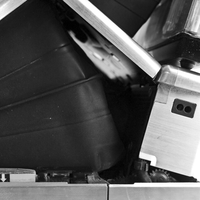
quite a contraption.
Finally, unlike most later Polaroids, the SX-70 is actually an SLR (note that the Model 3 is the exception). Excepting very early versions, these SLRs even have horizontal split-image rangefinders to assist with focus. This is useful, because the maximum aperture diameter (f/8) is larger than, and the closest focus (~10″) is closer than any Polaroid to follow. With few exceptions (Pronto! Rangefinder and Captiva SLR come to mind), future Polaroid models are either hyperfocal/focus free designs, or rely on the user to scale focus. Being an SLR also means that there are attachment optics available for telephoto and close-up work, and since the photographer can see through them, these are actually useful.
b/w conversion in post
Using an SX-70 has its ups and downs. Again, it’s manual focus, which is a plus for most creative photographers (even the later AF models have manual focus override). Focus is a convenient wheel over the shutter button, which is smooth and pleasant to operate. The shutter release itself is a soft-touch rubber button, which while lacking the satisfying clunk of an old mechanical release, does have a reassuring resistance and a good (albeit unique) feel. Where the camera is lacking to the creative photographer is in exposure control. The SX-70 follows another trend of the time – program line exposure mode. Unfortunately, the SX-70 offers only program mode, with no ability for the photographer to choose shutter speed or aperture. Even worse, the photographer also has no indication of what shutter speed/aperture the camera is wont to use. Limited control for backlight compensation, &c., is afforded via a knob to the left (from the user’s perspective), though not labeled in EV. This compensation knob automatically resets to ±0EV when the camera is folded. Metering is decently accurate (they were apparently ‘calibrated’ at the factory by dropping different levels of ND in front of the meter cell), but is not TTL.
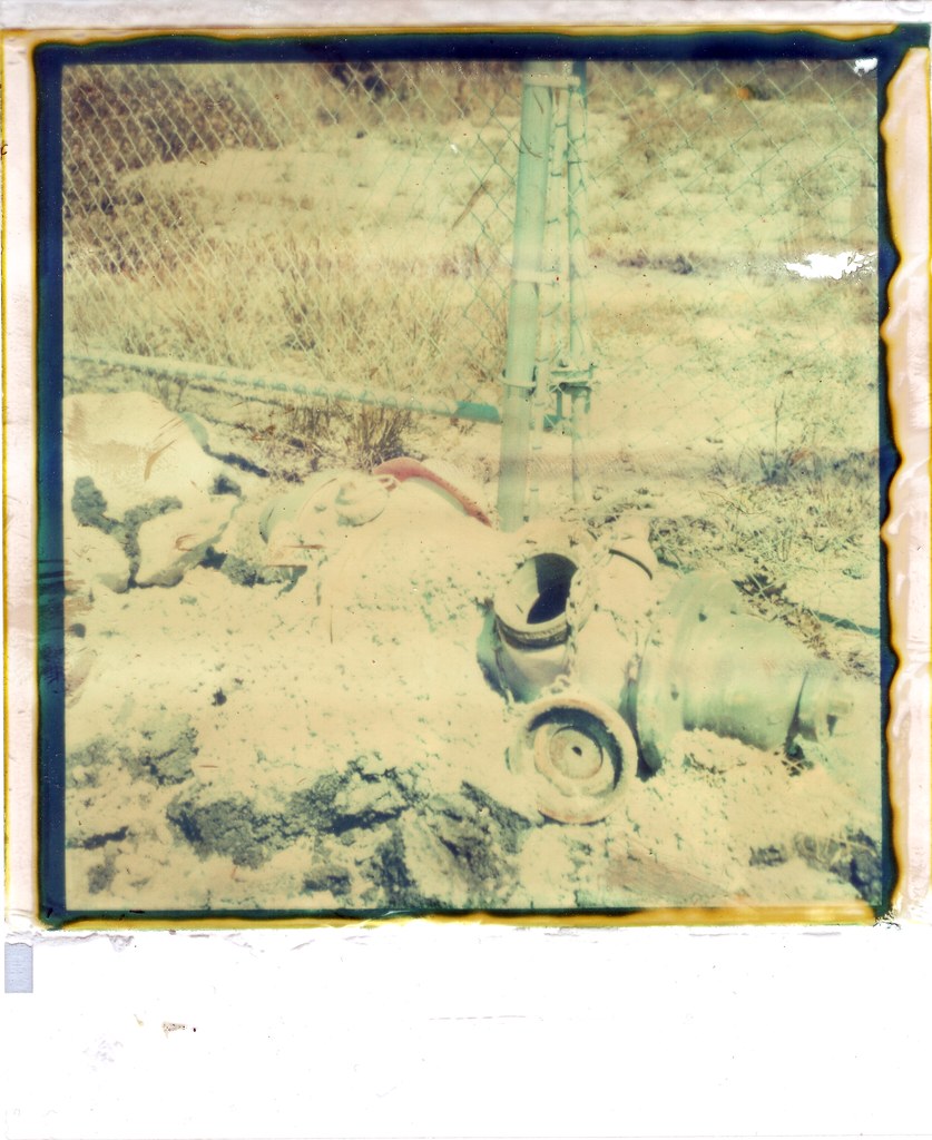
hydrant, old impossible fade to black
In the end, once you have an SX-70, you want to carry it around. Maybe not every day, maybe not most days, but every once in a while you buy some film and take it out, and it’s still just as charming as it was in 1972. You get used to the decisions it makes, you get used to the quirks of whatever film is being offered at the time, and though it may not be quite like any other camera you own, you love it. You don’t learn to love it, you love it right away, and you love it always. The SX-70 was a brilliant, ground-breaking design on the day Land first showed it off, and it’s still unlike anything else you’re bound to have in your collection. An expensive hobby, yes – the cameras are collectible (though not particularly rare), and the film is pricy, limited production stock made by a small company. But again, there is really nothing quite like shooting one.
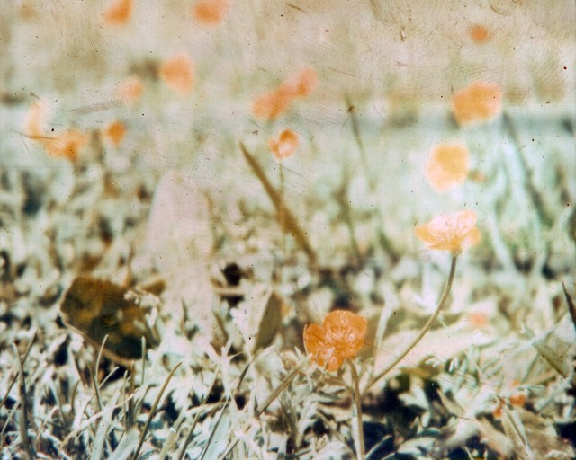
buttercups!