Square Format Photography
Note: this article originally appeared on http://brhefele.brainaxle.com, and at a time when I was only really able to shoot digital. Some of it is specific to digital, or to the DP2, though largely it is about the aesthetics of the square.
Square format photography has recently become a fascination of mine. Perhaps I should have been born in an earlier time, the era of the Rolleiflex TLR, a popular medium-format camera which shot in squares. But alas, these days it seems that 8×10 and similarly proportioned rectangular formats are expected of photographers. Art in general has long fallen back on rectangular formats, squares primarily occuring in the abstracted and nonrepresentational arts. Indeed, in school we were never encouraged to break from 8×10 photographic prints, trimming of the paper only served to repair a faulty crop. In all the art classes I’ve taken in all the schooling I’ve been through, the only squares I remember making were tiles for a high school ceramic class – a classic exercise serving double-duty as decoration for the front of the school itself.
So, regardless of my ability to use cropping Ls to form a square, I never did. It never even crossed my mind until I recently acquired a Sigma DP2, my first foray into digital (another story for another day). Cropping digitally is in many ways less pleasant than cropping in print, but it’s also very quick and therefore allows for quick discovery and experimentation. So, quite quickly, I discovered and fell in love with the square crop.
Why?
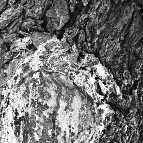
I do a lot of textures, especially on old trees. I find the square format works well for this, offering a no-nonsense, in-your-face presentation of a texture. I also like to use a square to frame things ‘square in a square.’ The above image is one of my favorites because it does both. It shows off a variety of tree textures in the square format. In my opinion, the angles and the curves of the bark simply wouldn’t have as much impact in a rectangular format. As for the ‘square in a square,’ I’ve intentionally shot it so that the darker bit of the tree frames the (white) sap-covered bit.

4:5 ratio

2:3 ratio
![]()
1:1 ratio
This is not the best example, but it does show off how an image’s proportions can affect the impact of the angles within. The first crop is 4:5, the same as an 8×10 print. It is my least favorite of the group, the angles have no impact whatsoever in my mind. Angles of a lesser degree would give the photo more punch, but would still have less impact than ~45º angles in a square frame. In comparing these three, I’d have to say that the 4:5 has the least interest because it’s almost but not quite a square. In art, you’re either in or you’re out, you don’t come close to being square and then give up once you hit 80%. The second image, 2:3, is the ratio that comes out of the camera. It’s wideness actually gives it a much more dynamic feel than its 4:5 counterpart. Finally, we have the 1:1 image, which emphasizes the ~45º angles in a very strong way, as they cut very neat pieces of the photo off at every slash. This is debatable, of course, but in my opinion, the simplicity of the square frame really lets the content within burst out at the viewer.
Finally, how?
When I first got my DP2, I wanted to turn on guidelines for quick approximation of my thirds. I always liked having a gridded finder when I shot film SLRs – it helps make quick compositions when necessary, and is easy to ignore the rest of the time. The DP2 offers three options – two lines (four blocks), four lines (nine blocks), and six lines (sixteen blocks). The first makes a lot of sense to me, it’s essentially a clearer reticule for spot metering, &c. The second, four lines, is what I was looking for – the lines fall on the thirds. The third, I could think of no practical use for. The lines fall on quarters rather than thirds, and I’m not especially familiar with the rule of quarters!I have since discovered that these lines are helpful for composing photos that I believe will make good 1:1 crops.

If we look at our LCD, broken into sixteen blocks, we can determine that every block is three units wide and two tall (by these numbers, we start with our full crop at 8×12). If we completely disregard the left side of the screen (top if we’re shooting portrait orientation), we end up with an 8×9 image, neatly broken into thirds (on the long axis – the short axis is obviously still broken into quarters, but every little bit helps). It’s not a square, but it’s close enough to get a quick square format crop composed.
The other big ‘how’ is how to know when square format will work. It’s a big decision, as you end up cropping out a third of your pixels! Clearly not every shot needs to be square format, and the easiest way to learn what best fits your own aesthetic is to simply try things. Set your crop to 1:1, and flip through a handful of photos. You’ll quickly see patterns, things that you like. I know by now that if something is relatively square or circular to begin with, that I’d probably like to match it up against my third lines and present it as a ‘square in a square.’ Learning comes quick with experimentation, and experimentation is easy when you don’t have to wait for a print to step out of the bath.
- An article by Gary Mortensen, singing the praises of 6×6.
- squareFormat group on Flickr
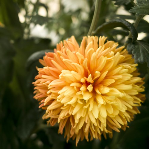
- My square photos on Flickr, including the flower and tree seen above (those individual photos link to their respective pages)