Moersch Easylith as Film Developer
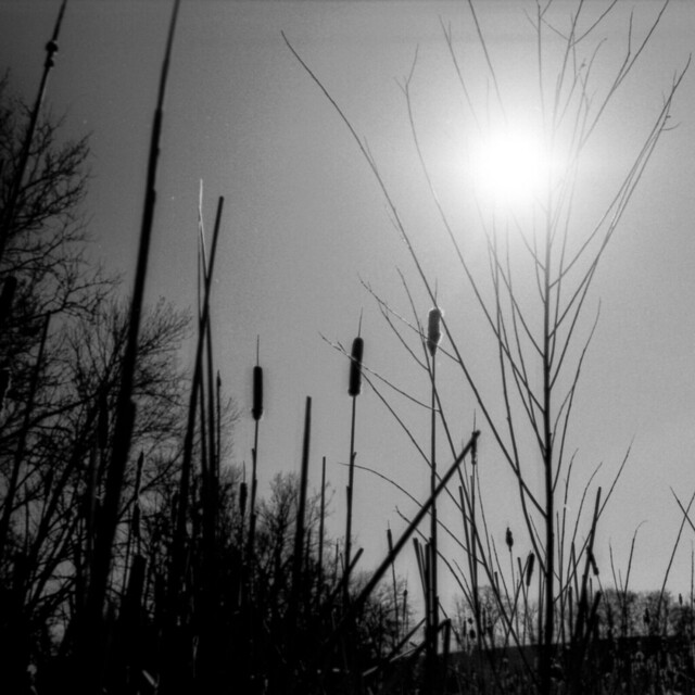 ilford panf+ developed in moersch easylith paper developer.
For as long as I’ve been interested in photography, I’ve been particularly interested in the aesthetics of high-contrast photography. We were supposed to shoot 400TX in high school, I shot D3200 and made contact prints off of contact prints on the highest graded contrast paper I could find. Now, I find even 400TX to be too fast for my daily pursuits, and I work a hybrid system – developing film, but going digital for post-processing and printing. Digital contrast curves are designed to not be too harsh, but still don’t quite compare to grabbing that contrast in a chemical reaction. So, recently, I decided to try an experiment using lith developer designed for paper on film.
The lith process is a high-contrast process used in the graphics world, for line art and document copy type work. It is a process done in the print stage, using special lith developer, and generally working off of a prepared contact-printed large format lith negative. Lith developers can be rather complicated, coming in as many as five-part systems. Carefully choosing your ratios can dramatically change the end result, which allows for a lot of creative control, but also introduces a lot of room for failure. Moersch makes a two-part lith developer designed to take a lot of the guesswork out of the process, called Easylith. Since these developers are not designed for standard negative film, a lot of guesswork was already going to be involved, so for my experiment, I thought Easylith would be a good start. It’s also rather affordable – $14 at Freestyle Photo works out to just over a dollar a roll at the ratio I’m working in, as a one-shot. And that’s for the smallest (most expensive by volume) set of bottles available.
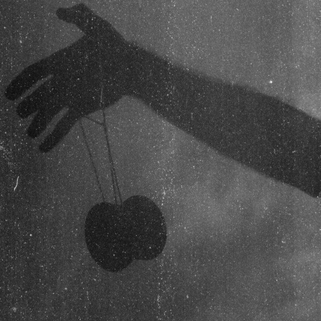 my first roll was extremely underdeveloped/underexposed.
With no guidance from the internet, my first roll was a failure. Negatives were incredibly thin, and when I was able to pull out an image,there was no major pop in contrast. I shot at box speed, used 5cc each of part A and B Easylith, developed at 25c for 10 minutes, agitating vigorously every 20 seconds. When developing paper in Easylith, one is recommended to extend development times, and agitate thoroughly, something I attempted to replicate on the film side. One shot that I had overzealously bracketed came out with decent density, and showed me that I was on the right track, I just needed to go harder. I shot my second roll at a 2 stop (give or take) pull, and used 8cc each of part A and B Easylith, agitating every 15 seconds. These negatives were very dense, and many of them very usable, yielding just the results I had hoped for.
The ‘give or take’ on my 2 stop pull is an important detail. The meter on the Pentax MX only goes down to EI/ISO 20. I was shooting PanF+, rated at 50, which is about a 1.5 stop pull when shot at EI 20. I compensated manually, but in several cases, had a gut instinct to pull even further, and so I compensated even further. My gut instinct was generally wrong, and many of my negatives were impossibly dense. For the sake of experimentation, this is good. I now know to meter for about a 2 stop pull, and trust that I’ll get an image, even if it doesn’t necessarily have the characteristics that I want.
 contrasty scenes like this backlit playground equipment really bring out the developer’s properties.
So, how then, to encourage that unreal contrast that I so desire? Well, shooting PanF+ was a smart choice, being a relatively contrasty film to begin with. Any of the stranger document films that Adox, Agfa, Rollei, &c. put out should give even stronger results. Shooting contrasty scenes, and in contrasty light certainly helps as well. In scanning, my hardware and software blasted such strong light through the negatives, and tried so hard to make them ‘normal,’ that tweaks were necessary in post-processing to bring back the contrast that shines through so brilliantly on the negatives themselves. Finally, I will continue to tweak the process, based on the effects that such tweaks would have if I were doing a normal lith process. This means messing with agitation (which encourages development of highlights), ratio of dev:water, and ratio of a:b. So far, I’m very happy with my results, and it’s only taken me one wasted roll. If anyone out there tries this process, I’d love to hear/see the results, so drop me a line here or on flickr.
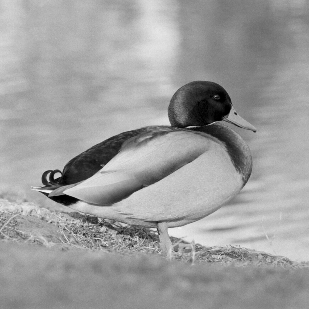
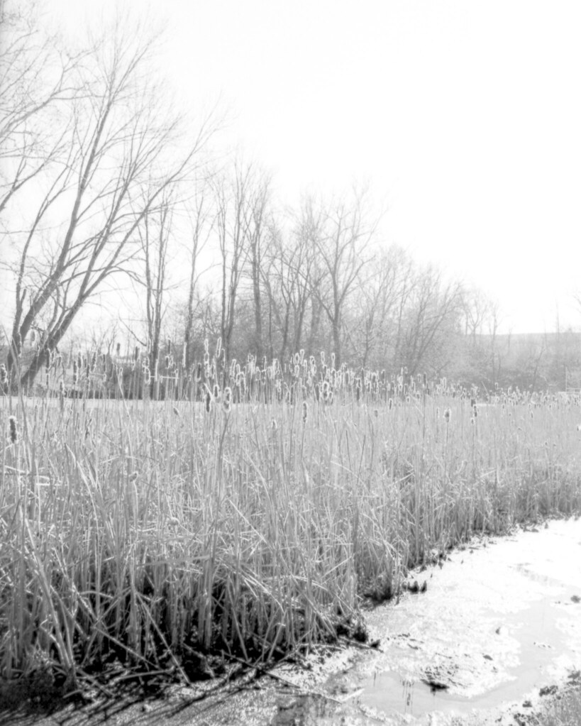 easily my favorite shot off of roll two.
Pentax Super Program
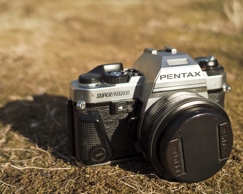
Recently, in replacing my beloved Pentax MX, I also happened upon a Pentax Super Program. Some might disagree, but I would consider the Super Program to be the last classic camera Pentax ever made. It’s not the last manual focus body they ever made, nor even the last manual advance. But it’s the last with a classic look, a classic heft, and relatively few/simple settings. It’s not a ‘pro’ body by many definitions – indeed, at the time it was released, a fully electronic shutter with no mechanical fallback was a dangerous proposition. But it does have four exposure modes, a solid meter, decent finder readout, and features that creatives yearn for, like DOF preview.
A fully electronic camera with a wealth of automatic modes is not typically what I look for in a camera. Primarily, I shoot fully manual bodies, only because these tend to be tough, fully mechanical bodies as well. In reality, shooting manual based on your camera’s meter is no different than shooting Av or Tv (assuming you have adequate compensation), or Program (assuming you have program shifting). I don’t have a snobbish ‘artists only shoot M’ opposition to automatic cameras, I just don’t own many and therefore don’t use them often. This is all to say that the Pentax Super Program is not really ‘my type’ of camera — and I was shocked at how much I love shooting it.
 the main control knob, buttons for changing shutter speed, and shutter speed readout lcd.
My ideal interface to a fully automated camera is a normal shutter speed dial, with the addition of an Auto setting, and exposure compensation right on the dial. My least ideal interface is the PASM dial, with actual settings moved to the background, and likely a handful of extra silly program modes tacked on the knob. The Super Program is somewhere in between. It has a main control knob with Auto and Manual settings — these dictate the shutter operation only. Setting a manual aperture on the lens, or setting the lens to its ‘A’ setting dictates how the aperture operates. So, for fully manual, pick an aperture and a shutter speed (main dial on ‘M’); for aperture priority, pick an aperture and set the main dial to Auto; for shutter priority, pick a shutter speed (main dial on ‘M’) and set the lens to ‘A;’ and for Program mode, set both the lens to ‘A’ and the main control dial to Auto.
The main control dial also has dedicated settings for 125 (TTL flash sync speed), bulb, and shutter lock. Next to the knob are two buttons, used for adjusting the shutter speed in ‘M’ mode. Ask someone if they think you should get a Super Program (or, an older ME Super), and this button interface and lack of a proper knob will inevitably come up. It’s definitely different, and I’m certainly more used to a knob. But, in practice, shutter speeds can be changed quite rapidly with the button interface, and it’s really very usable. The finder has two LCD segments for information. In most modes, one side displays shutter speed and the other aperture. In metered manual mode, however, you lose aperture info for the sake of the meter (±EV readout). If you want to shoot metered manual primarily, you’re better off with an MX — more finder info, and the LED meter is more immediately recognizable.
 duck, shot in aperture priority mode with a rikenon 135/2.8 on the pentax super program.
The half-press switch that activates the meter is incredibly flaky on my example. While this is inconvenient, fortunately if the meter is not already on, the camera does meter right before the shot is taken as well. This means that even if I can’t get a readout beforehand, I will get a properly exposed shot if I’m in an automatic mode. Exposure compensation on the right-hand side is not particularly odd, but I definitely prefer it to be built into the main shutter dial. The camera is not particularly small, being somewhere in between a K-series and an M-series. Film loading is convenient, using the Magic Needles take-up spool. While the camera feels overall very sturdy, the film advance is incredibly cheap and plasticky feeling. The electronic shutter (15″ to 1/2000″) makes a beautiful noise when fired. There is a backlight for the finder display, but it’s a bulb, and consumes an enormous amount of power from the 2 SR76 cells.
All in all, the Super Program is a really fun, easy to use body. I still prefer my MX, but I have no qualms about grabbing for the Super Program. I’ll probably have it cleaned up at some point to get the switches working (not just the half-press switch — my backlight switch isn’t the greatest, and the self-timer switch barely works). But even with incredibly flaky switches, the camera is very usable. I probably won’t bring it out on many night shoots — long bulb exposures will likely take a toll on the batteries. But it’s a great camera to have around, especially for the relatively low prices they demand.
Trichrome (Three Color Separation Process)
The above image was shot on Fuji Neopan Acros, a standard black and white film stock. Yet, as is plainly visible, a full range of color has been reproduced. How? The oldest color-reproduction trick in the book — color separation. By recording a series of images (in this case, three), each containing a different isolated color element (which we might refer to as a channel), we get pieces of a whole that can be reconstructed to form a color image. Here, I’m using the logical combination of three primaries — red, green, and blue.
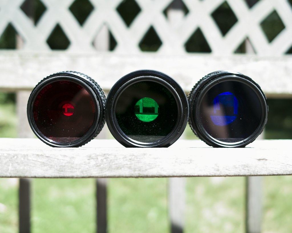
the three filters used in an rgb (trichrome) color separation photo.
Specifically, the three filters I’m using (seen above) are a Wratten 29 (red), a Wratten 61 (green), and a Wratten 47 (blue). I don’t think this is actually a perfect set — if memory serves, a deeper red would actually fit the green and blue better. But, getting filters in the odder Wratten numbers is tricky enough, and the 29, 61, 47 set works fine for my purposes. I’m using Tiffen filters, which are not necessarily the quality of B+W or Heliopan, but are affordable and, more importantly, available in a wide range of Wratten numbers. These filters are quite deep, and do rob the film of light — 3EV for the red, and —2.5EV for the green and blue.
a shadow present on only one of the three frames — in this case, green — turns out the inverse color.
Since the process involves shooting three frames, and attaching/detaching three filters, care must be taken to keep the camera stable. The sturdier the tripod, the better. I suppose this is one instance where having a motor drive might help, reducing the potential for camera movement during frame advance. I’ve had decent luck, however, with just a small Novoflex tripod, and a manually-advanced body. I never screw the filters on too tightly — each one will only be on for a single frame at a time anyway.
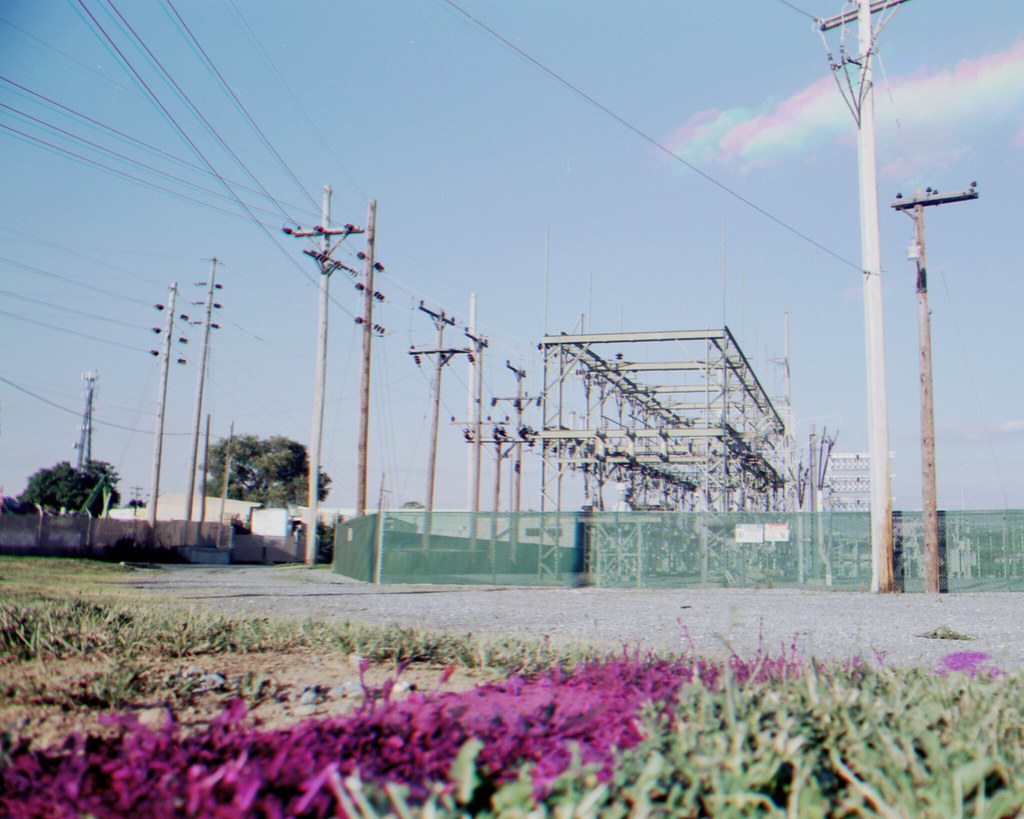
here, a person is visible on the red frame, a car on the blue, and two suvs on the green.
Since the filters are quite dark, I frame the shot before any of them go on. I meter while I’m framing, just to save time and energy after. For each shot, I compensate manually with the previously listed values. I always shoot them in order — red, then green, then blue — so that there’s no confusion afterward. Reconstructing the image in Photoshop is relatively simple. Bringing in all three layers is always the first step, and then either allowing Photoshop to auto-align them, or aligning them manually by viewing the differences of two at a time and adjusting accordingly. From there, the file can be converted from greyscale to RGB, and each layer reassigned to the corresponding channel. But, the method I prefer is to compensate for exposure and set each layer to screen over the next. I have a Photoshop Action just for this. Simply name the red layer ‘r,’ the blue layer ‘b,’ and the green layer ‘g,’ and the Action does the rest using Adjustment Layers for non-destructive behavior.
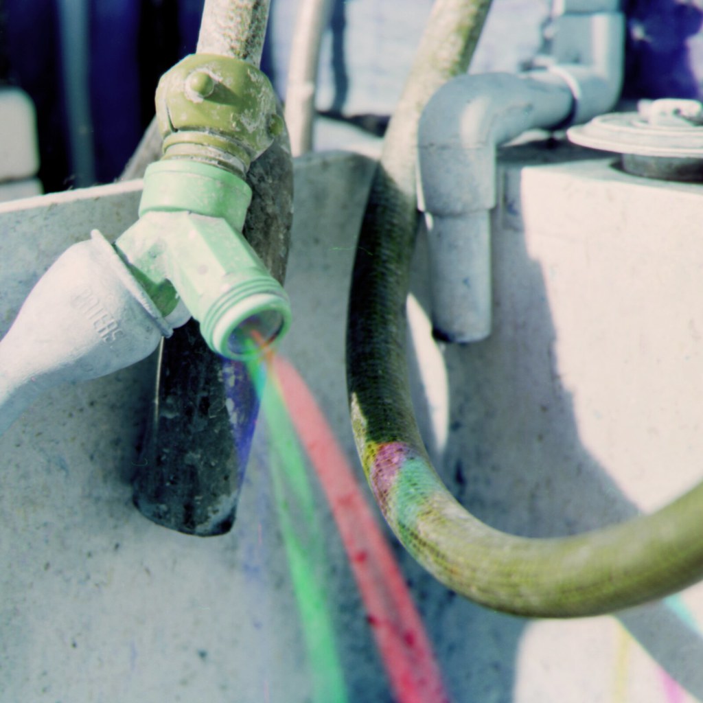
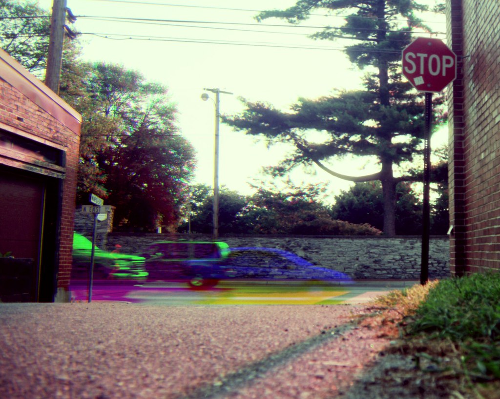
the three colored streams were created by adjusting water flow differently between each of the three filtered shots.
I guess the only thing left to address here is the matter of why.While home processing of color film has been made far more accessible recently, black and white is still cheaper, safer, and simpler. That’s kind of a cop-out reason due to the impracticality of trichrome photography — consider, for example, getting a human subject to stay still long enough for a crisp portrait. A more reasonable reason is simply that the temporal gaps between the three color channels leave plenty of opportunity for creative effects. Subjects moving in and out of frame will leave brightly colored ‘ghosts.’ Trees blowing in the wind will have multicolored glows about them. Water will shimmer prismatically and clouds will be like those from a dream. This is my reason — experimentation and a resultant image distanced yet further from reality.
While most b/w films are these days, it’s still wise to make sure you’re using panchromatic stock. Orthochromatic films like Efke lack sensitivity on the red side of the spectrum, and won’t do well for color reproduction. Be sure to check out the trichrome group on Flickr.